 中文
中文
INTERIOR|FOOOO CITY CLUB
PROJECT DETAILS
Location: 交子大道成都悠方购物中心U8酒吧街二层(W酒店大堂对面)
Chief Designer & Team: Mojo Wang | Alba Beroiz
CAD Designer: 王欢
Installation Designer & Team: 二手艺术家
Lighting: 欧未照明设计 | Oway Lighting
Photography: 行在建筑空间摄影-贺川
Area: 575㎡
Year: 2019
CHAPTER.1
CONCEPT
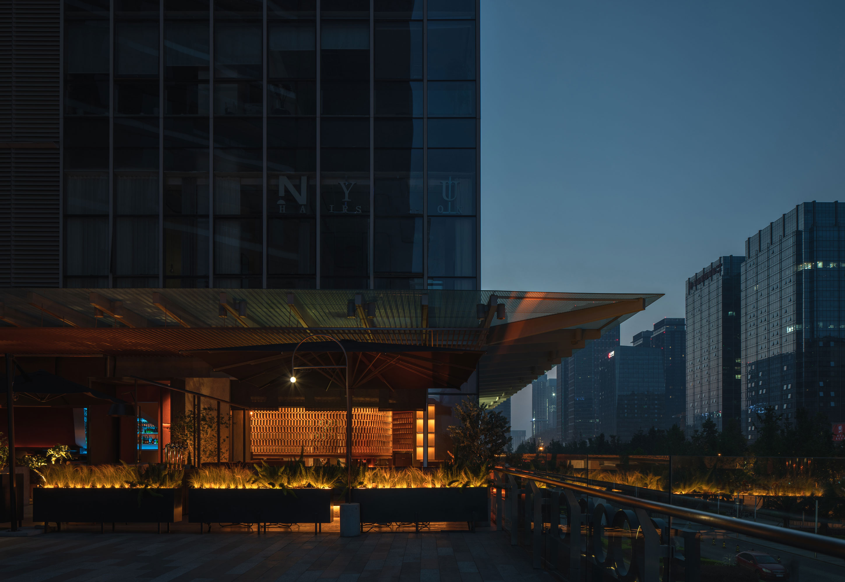
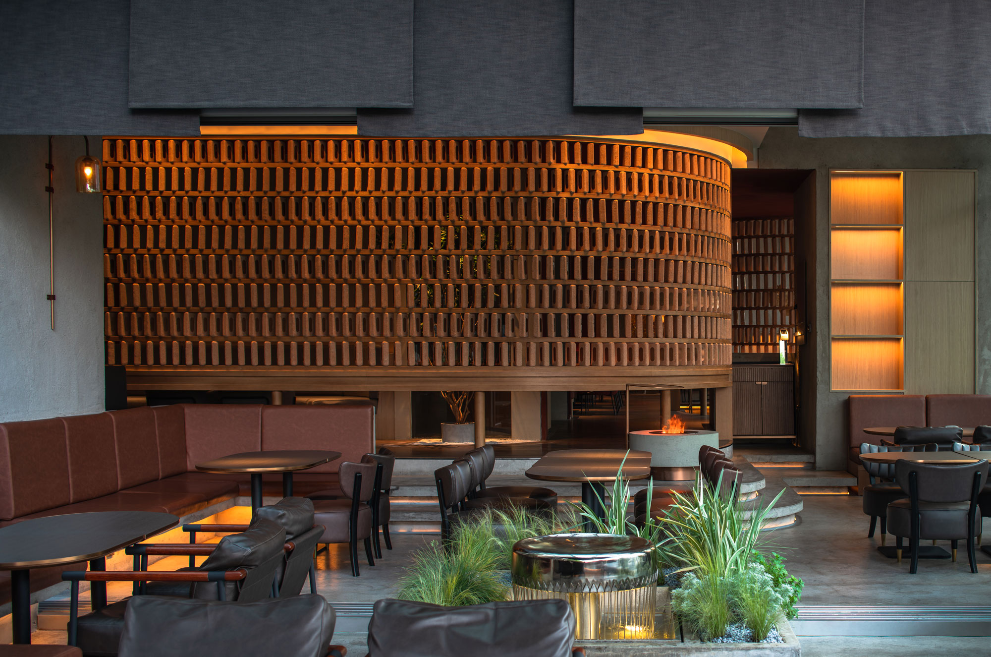
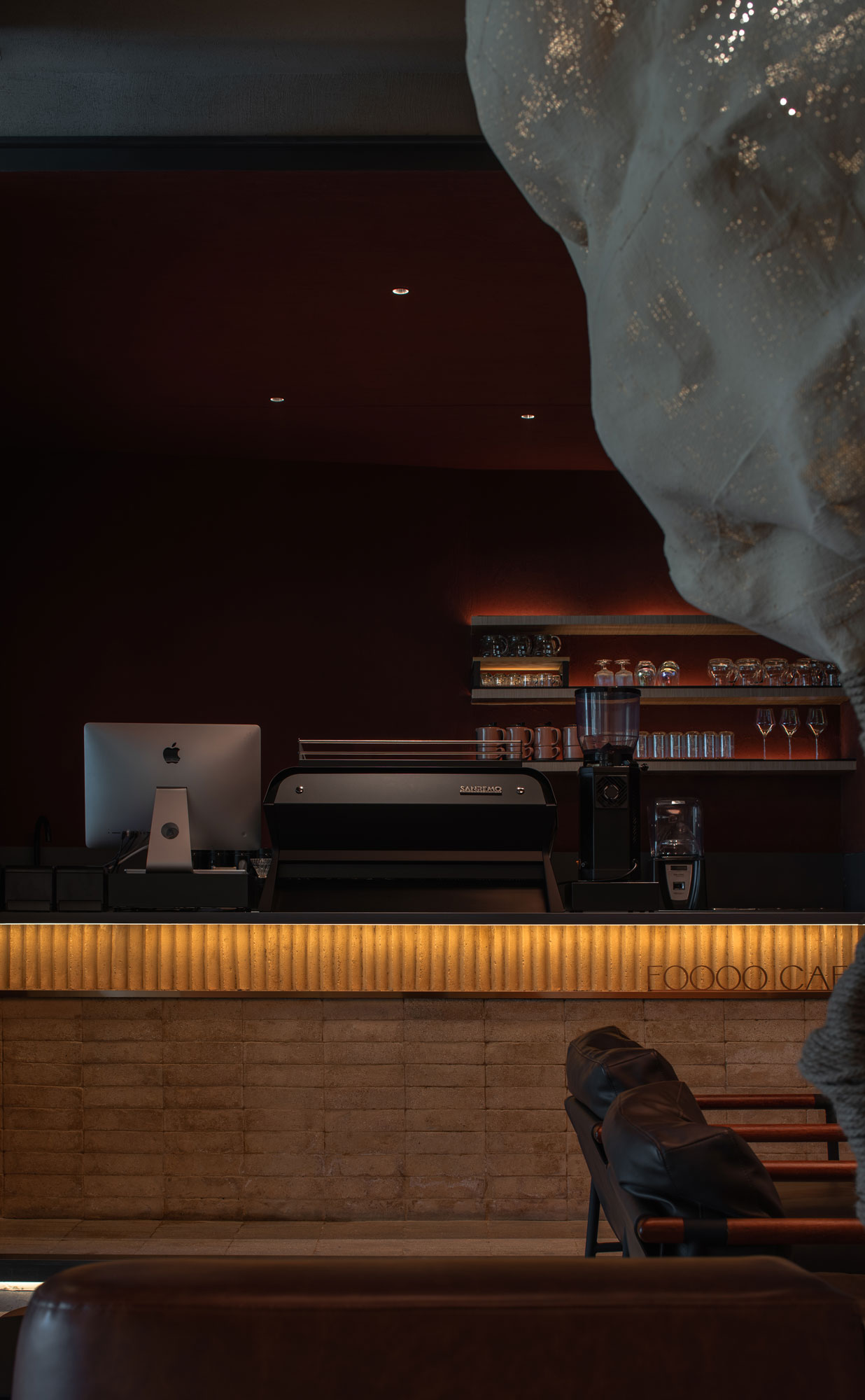
FOOOO CITY CLUB悠方店位于成都高新区,设计团队将成都本土的“院坝”文化氛围置入现代精致餐饮文化内,以打破快节奏生活方式,为街区消费者提供一缕休闲放松的就餐与社交时光。项目设计概念围绕庭院的探索展开,以“水/火/云/树/石”五个象征元素打造的微型庭院作为公共场所将空间依次划分,并以回廊串联,将本土文化的记忆符号与现代建筑体有机结合。打破常规室内外关系的空间结构及新旧材料的质感碰撞,共同营造了“疏密得益,眼前有景,曲折尽致”的探索体验。
The design intends to bring the relaxed atmosphere of the Chengdu traditional tea gardens to the fast-paced High-Tech district where the project is located, providing the customers a modern exquisite catering experience. Based on the layout of Chengdu's tea gardens, the design revolves around the concept of the courtyard. Different yards, represented by the different elements found in nature (water, fire, clouds, trees, and stone), bring the outdoors to the indoors. A winding canopy connecting them invites the customer to explore further: when visitors walk through, they encounter different views and experience different atmospheres.
CHAPTER.2
LAYOUT
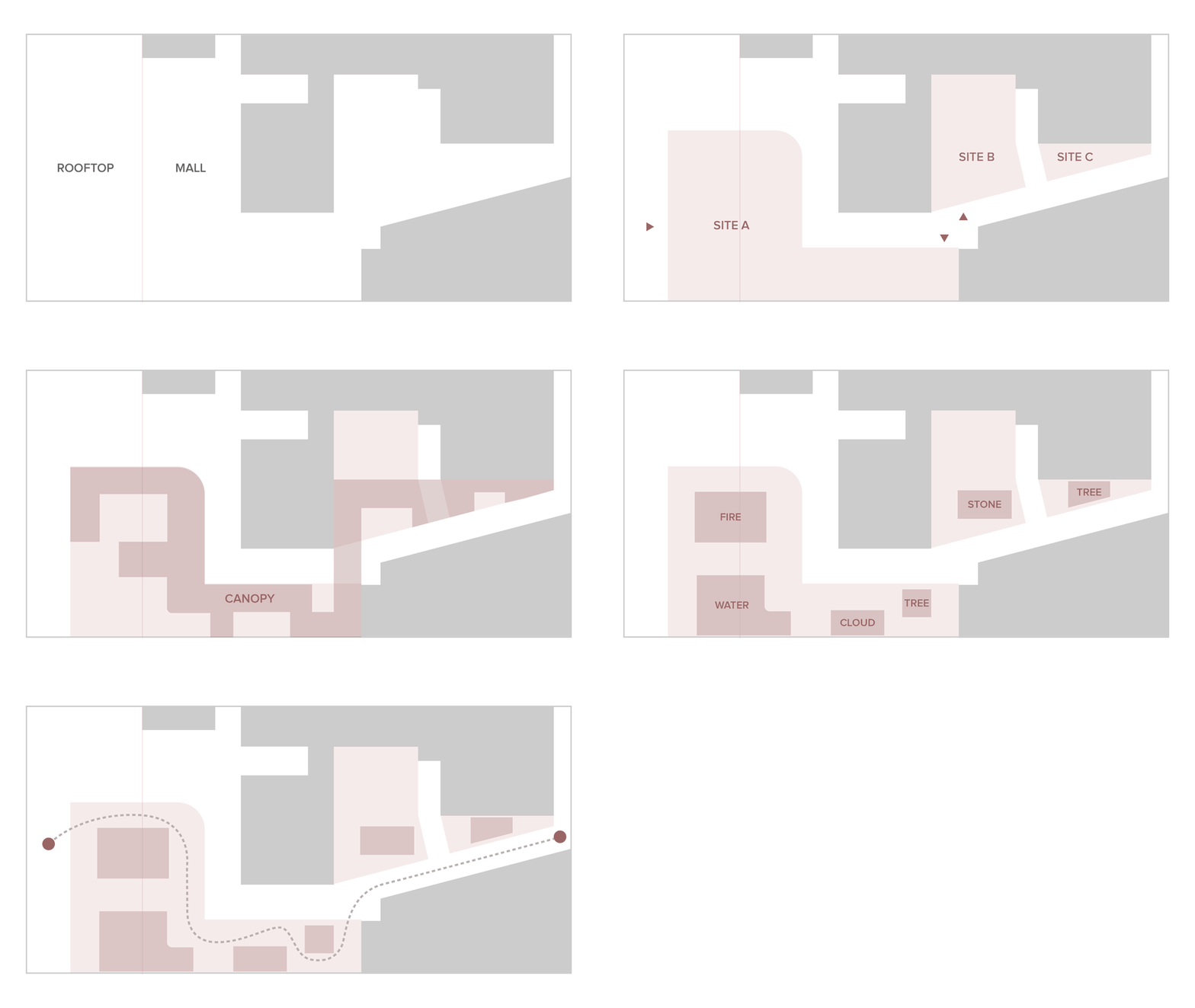
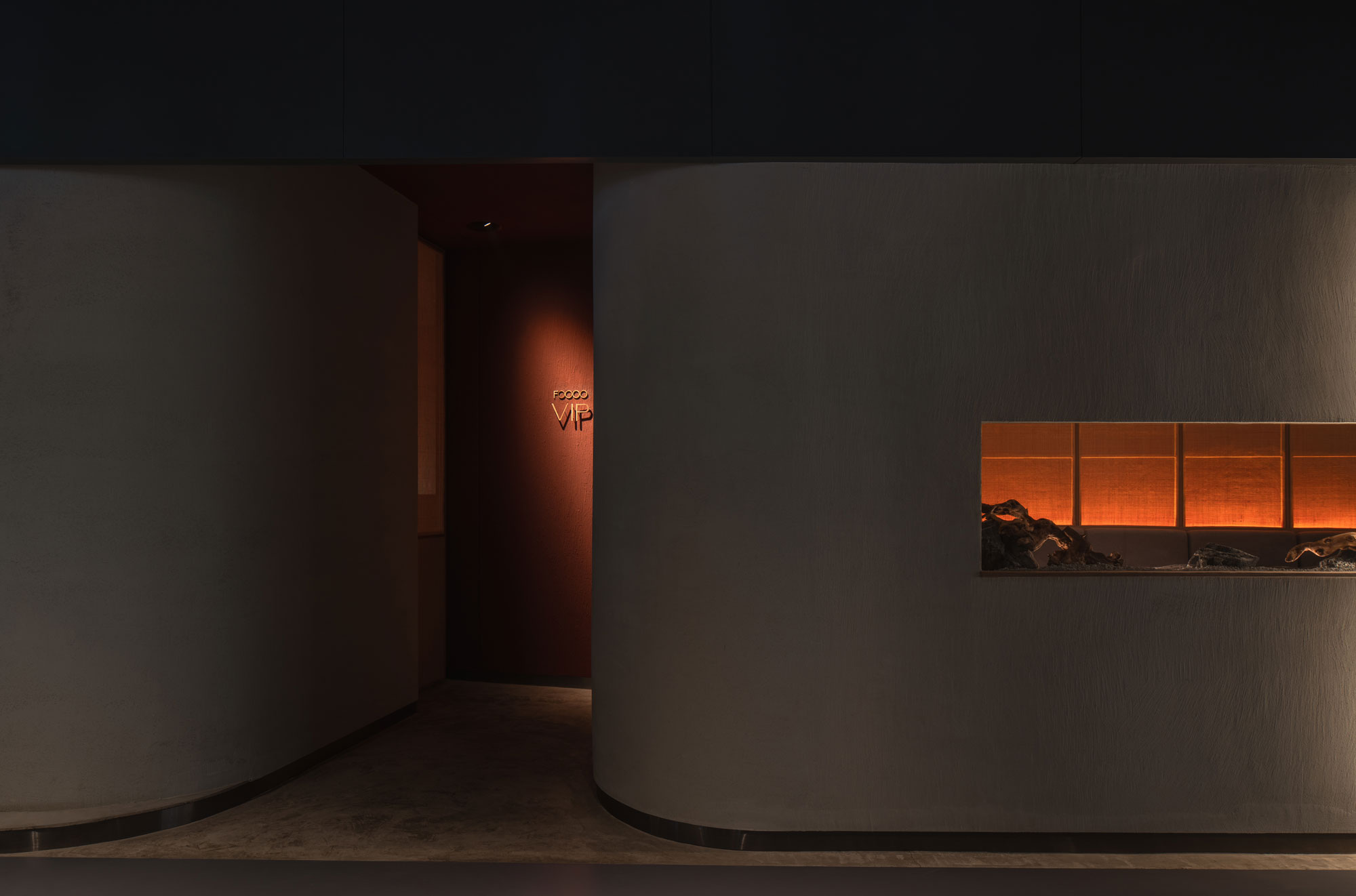
项目一共包含三个独立单元,由购物中心的走廊分隔,通过传统屋盖回廊的连接方式将场地始末端串联,形成动线的同时连通屋顶花园与商场内部,使室内外空间产生强有力的联系。内部区域错落有致的抬升分割公共属性及私密属性,将休憩和交流两种状态整合于一体。设计团队围绕五个元素依次展开平面布局,还原庭院移步异景的视觉呈现。
The assigned site consists of three independent units, separated by the shopping mall's public corridor. The two ends of the site are connected by the meandering canopy, that links the rooftop garden to the inside of the mall. A raised platform echoes the canopy, allowing all customers privileged views upon the boulevard, and creating two levels of privacy: public in the yards and more private under the canopy.

CHAPTER.3
THE EXPLORATION JOURNEY
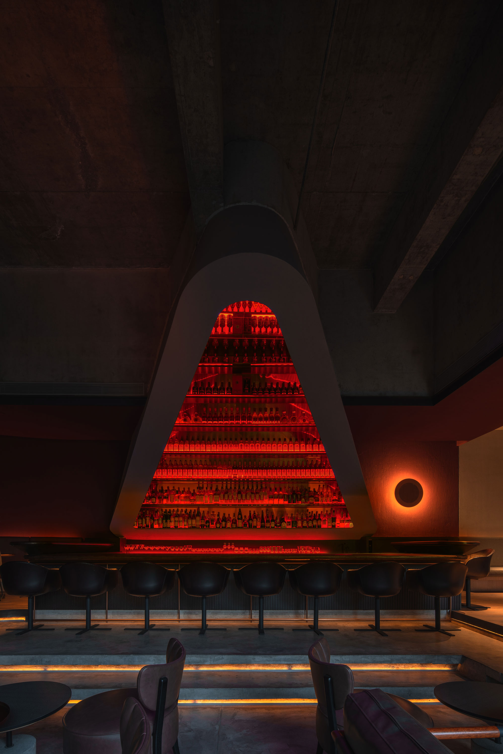
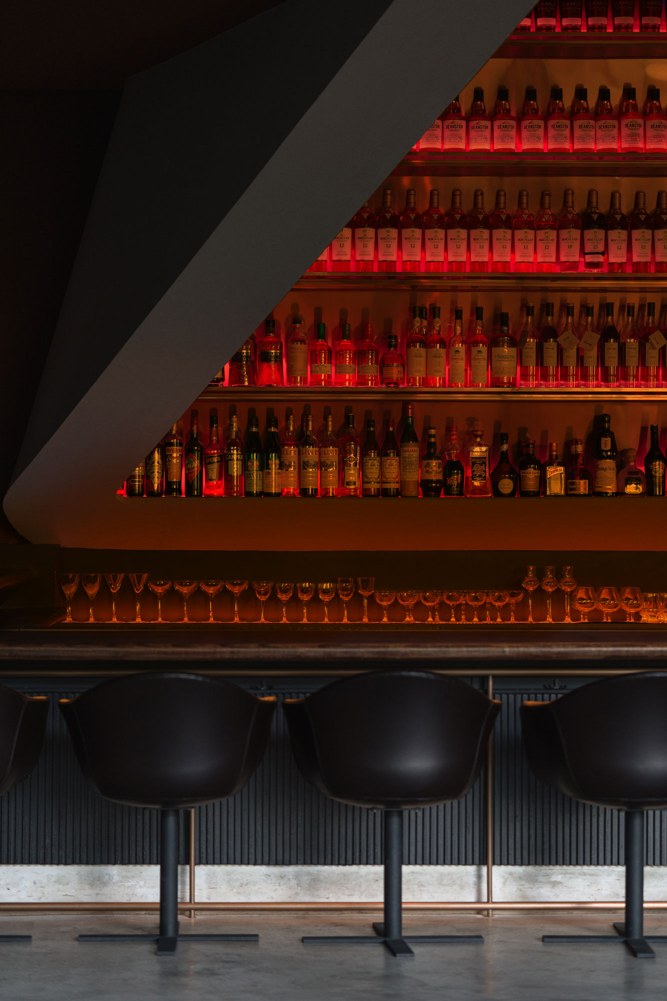
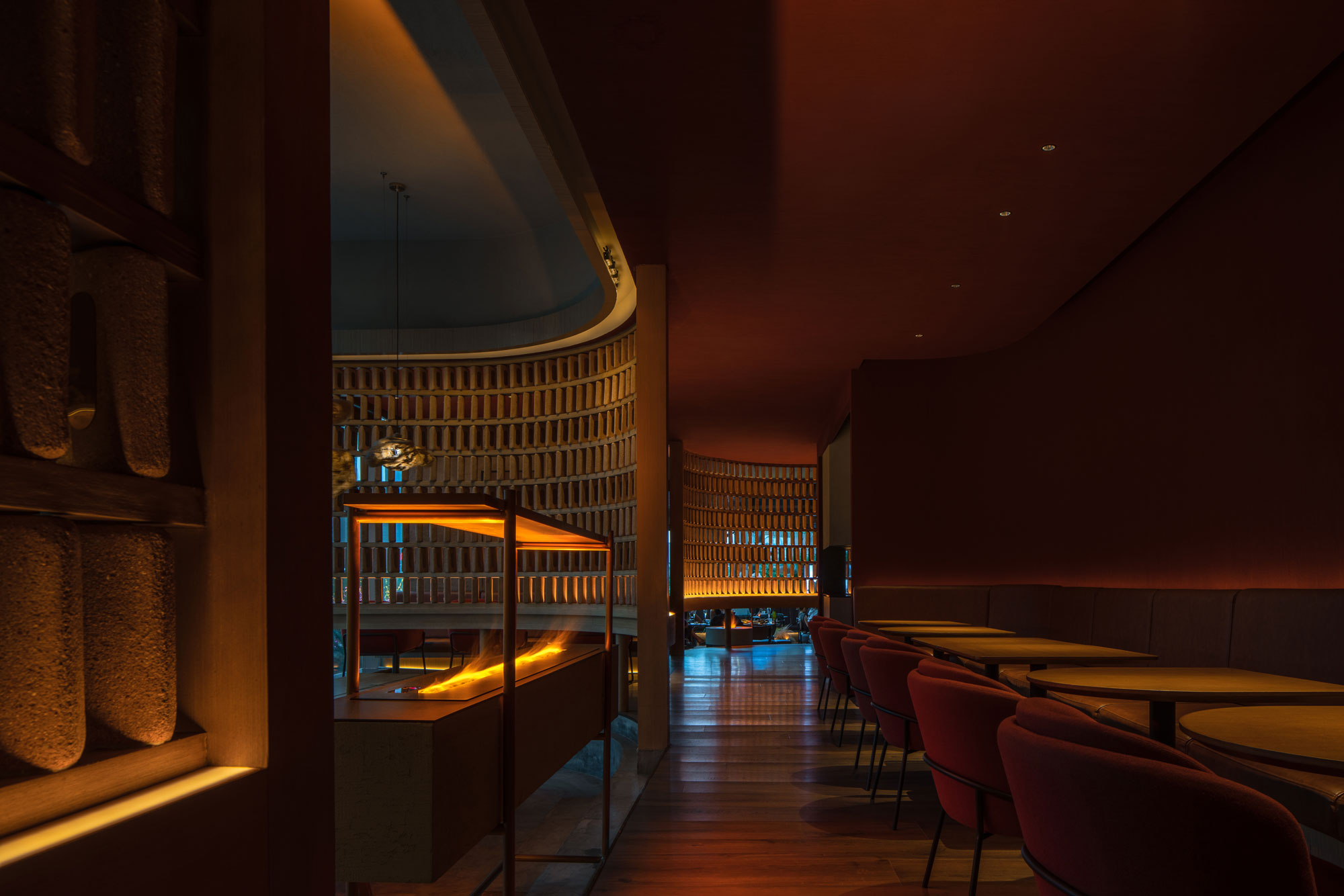
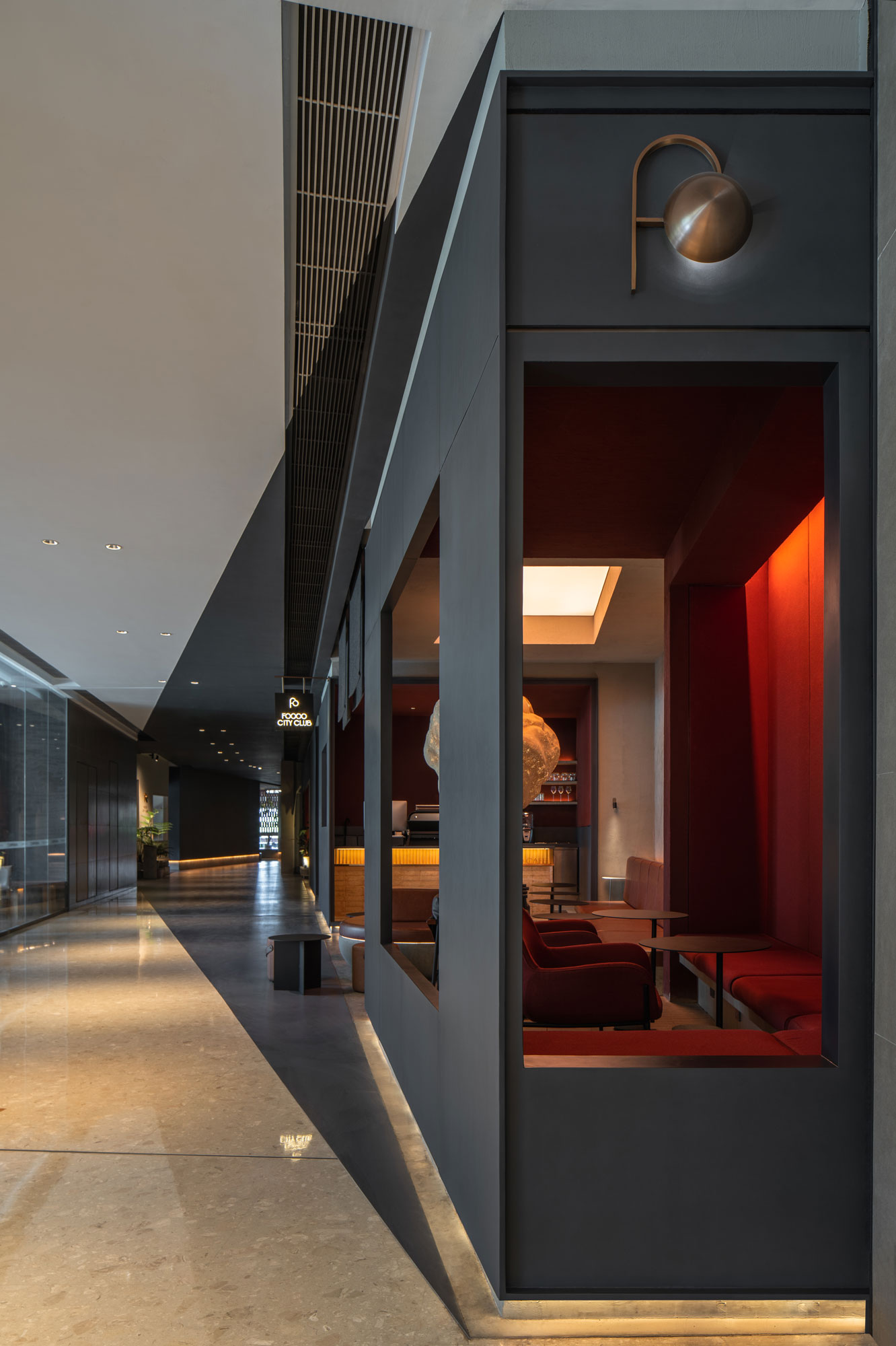
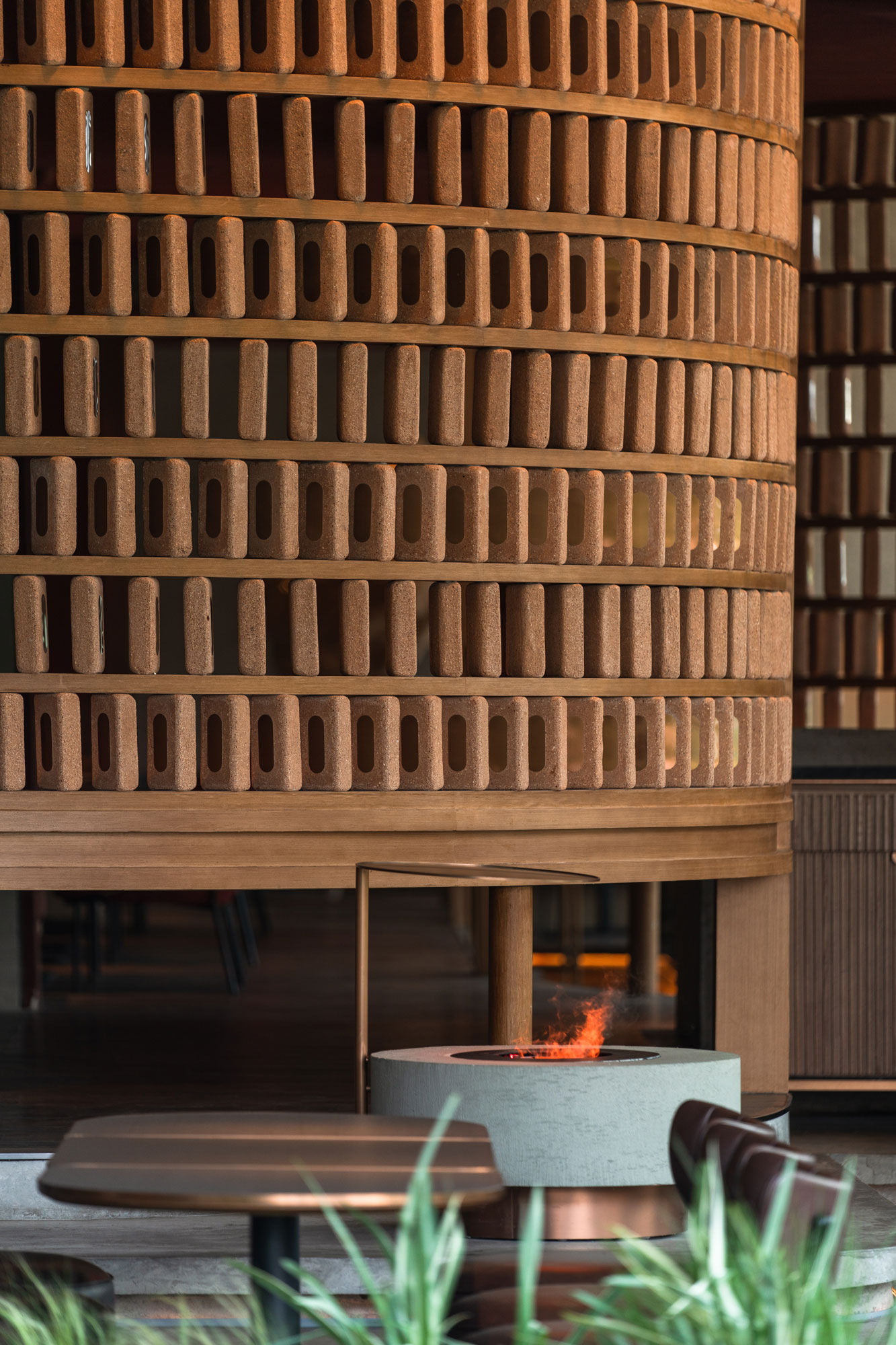
为强调户外院落的自然属性,设计概念中象征自然的5个元素被纳入作为设计重点。“水”与“火”作为喷泉及火炉的象征符号置于室外入口的左右两侧。围绕火炉的吧台区域悬挂三角棱镜,持续变化的颜色搭配温暖的火焰,为门店营造温暖的氛围。水声搭配植物的芳香使庭院更加适合下午茶与晚餐时段。这两个区域从室外延伸至室内,落地玻璃隔断的运用为室内空间带来大量光照,模糊室内外界限。
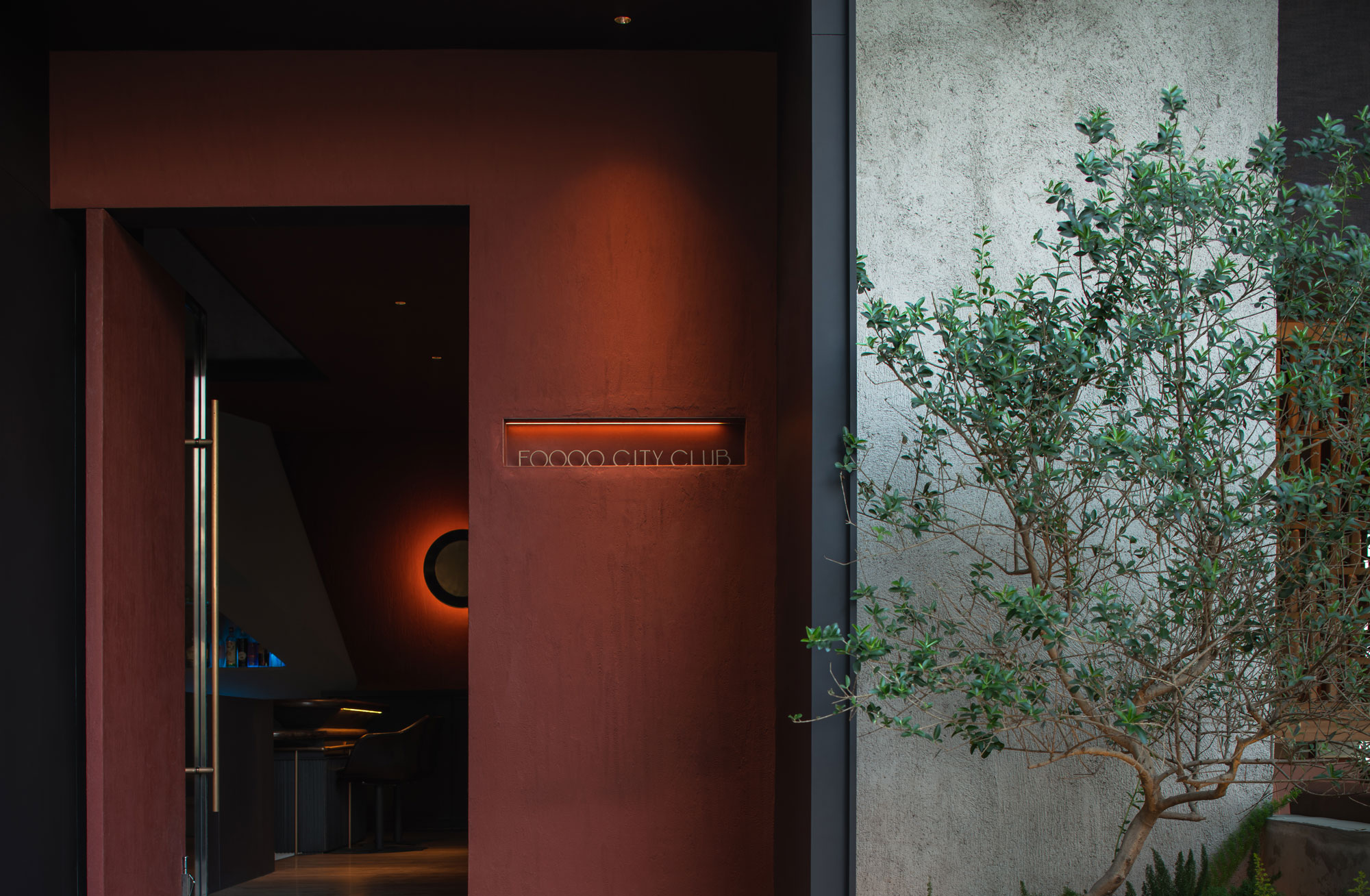
To emphasize the exterior nature of the yards, natural elements are incorporated as focal points. The main entrance is located in-between the "fire" and the "water" yards. The first one, organized around a fireplace, is the bar. A sculptural triangular prism displaying bottles dominates this space. As a backdrop of the bottles, gradual color-changing lighting plays with the fireplace's warm flame, creating a lively atmosphere for the bar. At the "water" yard, where the fountain is, the combination of the sound of water together with the fragrance of aromatic plants make this area an ideal place to enjoy afternoon tea and wine on warm summer nights. The two yards extend from outdoors to indoors, where a sliding door partition blur the boundary between them.
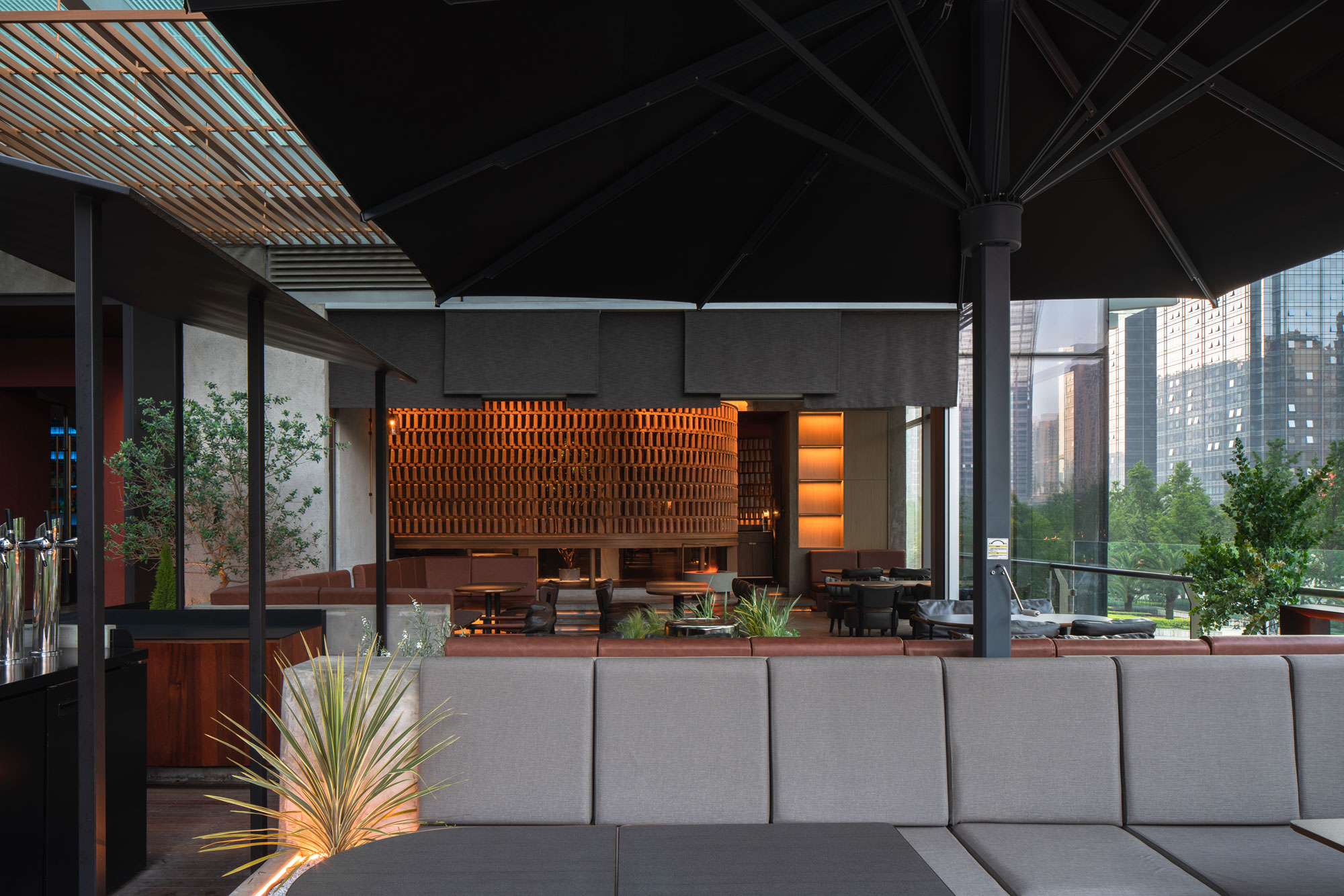
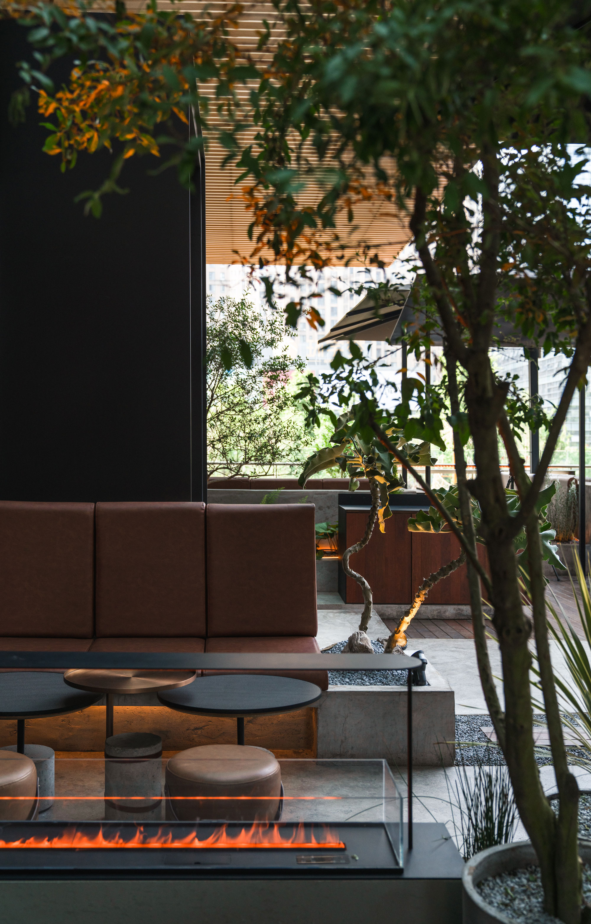

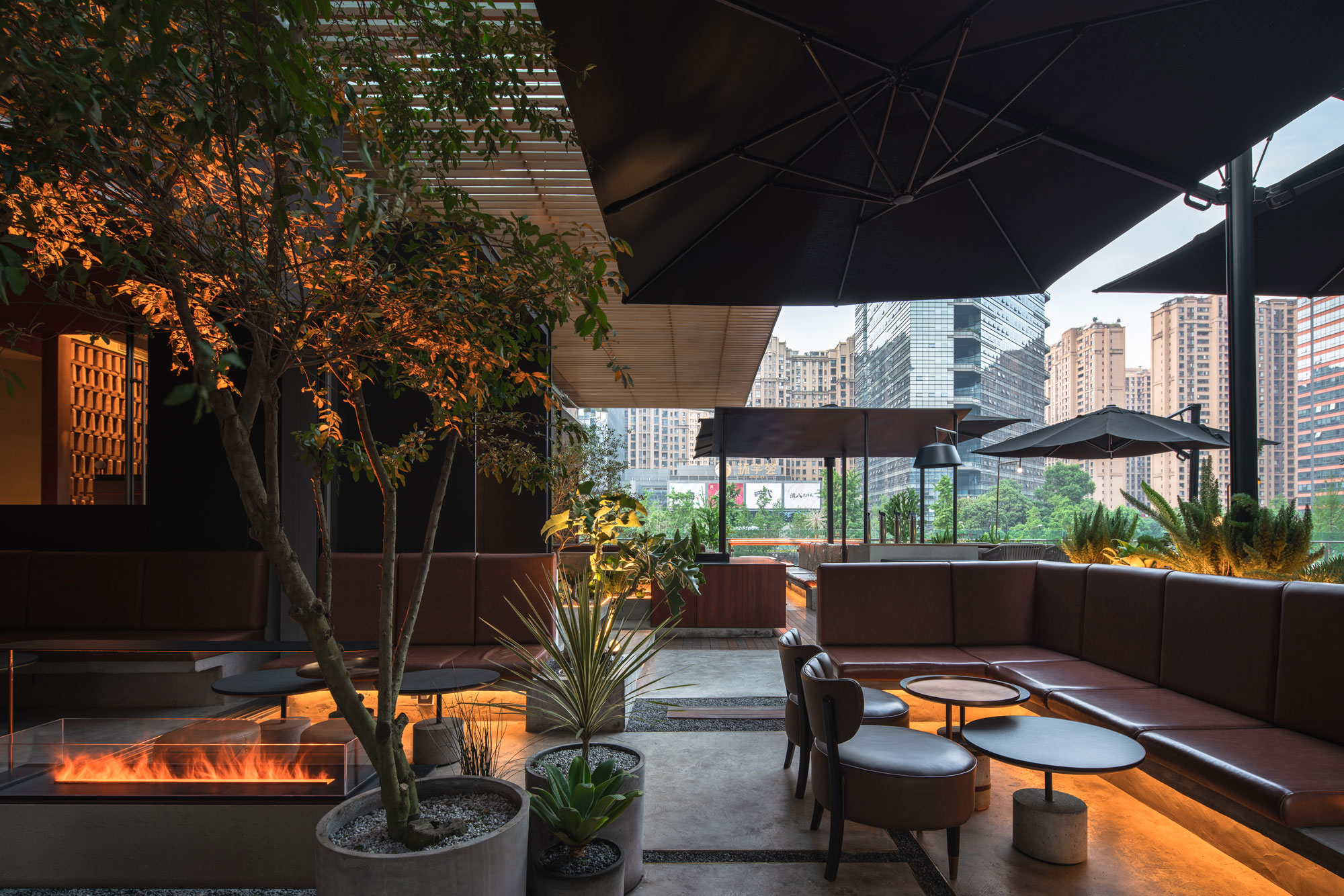
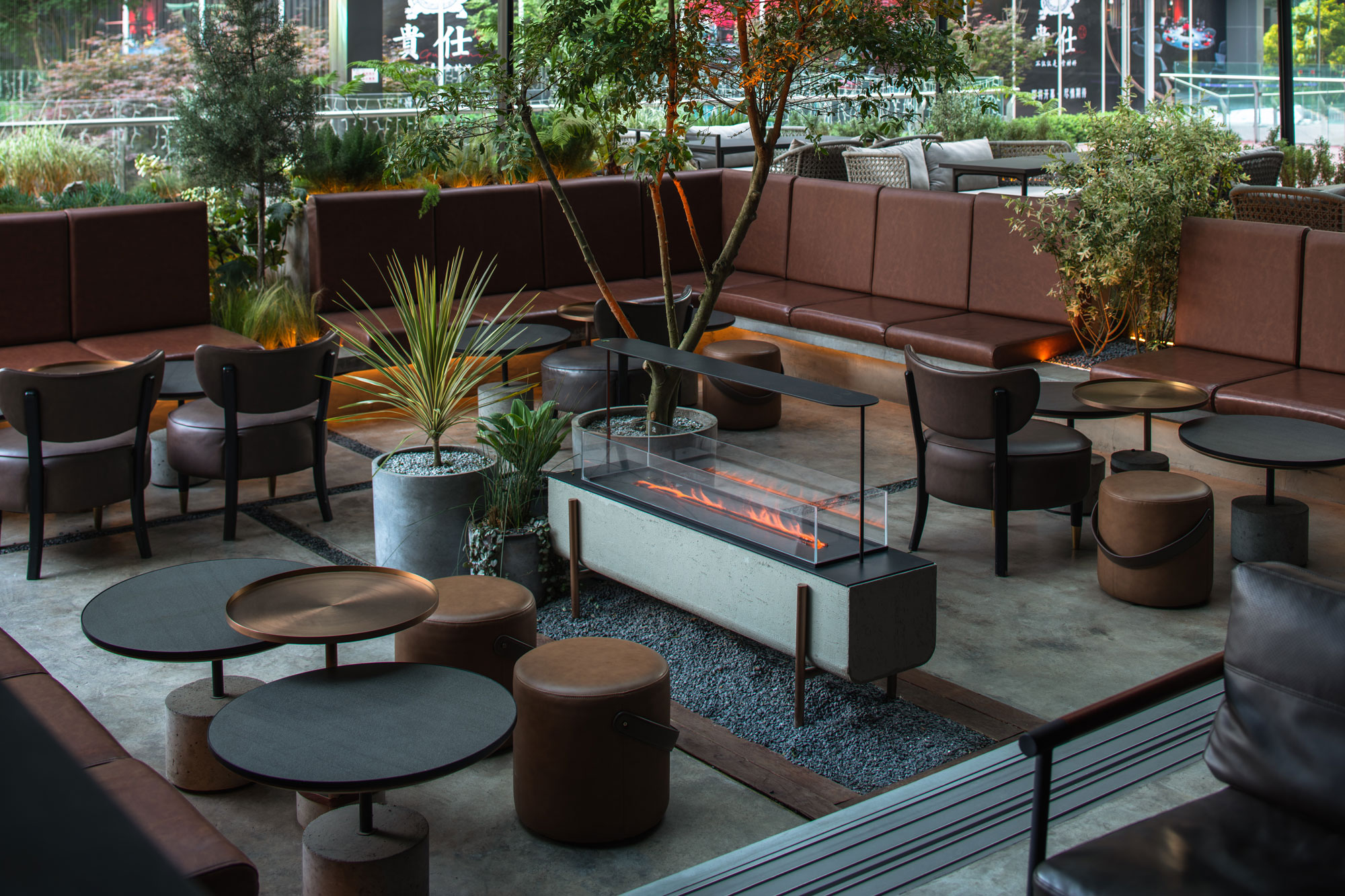
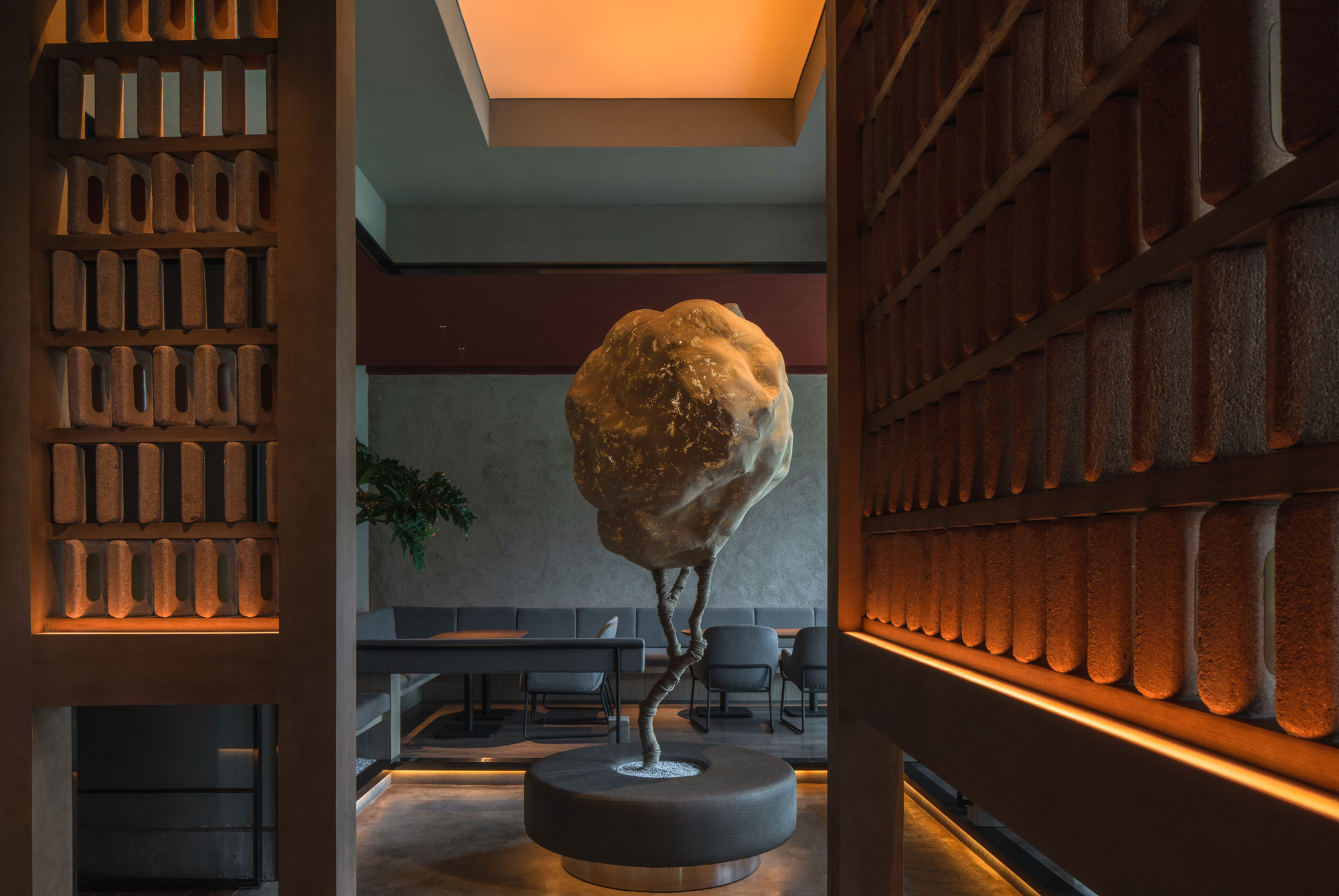
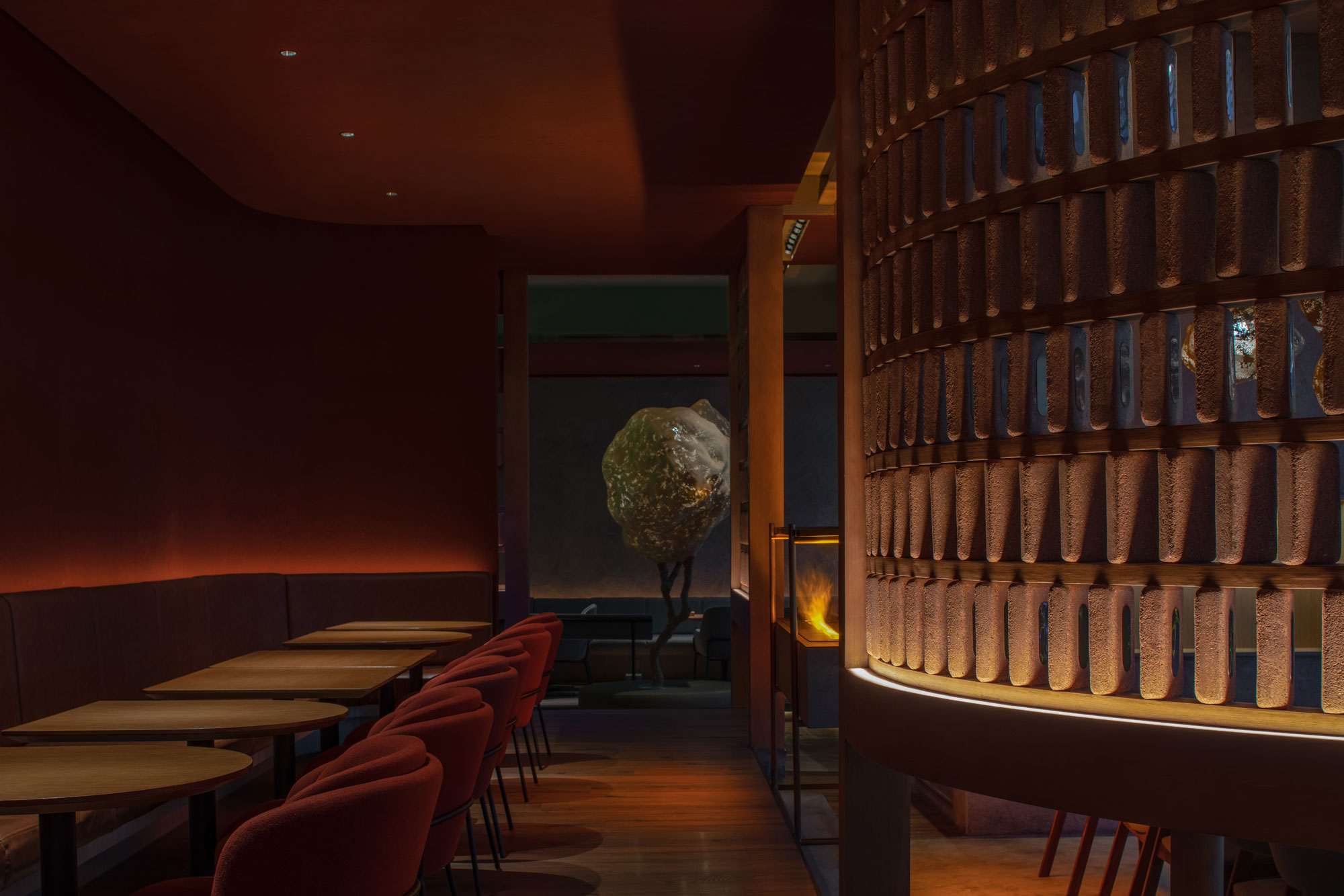
“云”区域位于门店窗边,项目独特的地理位置使得窗边的座位具有极为开阔的视野,搭配云朵灯光强调“漂浮”感。曲径的回弯处围绕一棵手作树型立灯,放大庭院属性,树木与“石”区域的枯山水相呼应,将视觉动线延伸至内部的咖啡休息区。
From the "cloud" yard, customers can enjoy an open view of the boulevard below. The cloud-shaped lighting fixtures emphasize this "floating" feeling above the street. Custom made sculpture-trees are placed in the center of the two "tree" yards, under an artificial skylight that mimics the exterior sunlight. Here, sitting under the shade of the trees, customers can drink coffee and wait for a table on busy days. The "stone" yard appears as the connecting element of the two "tree" yards.

CHAPTER.4
MATERIALS
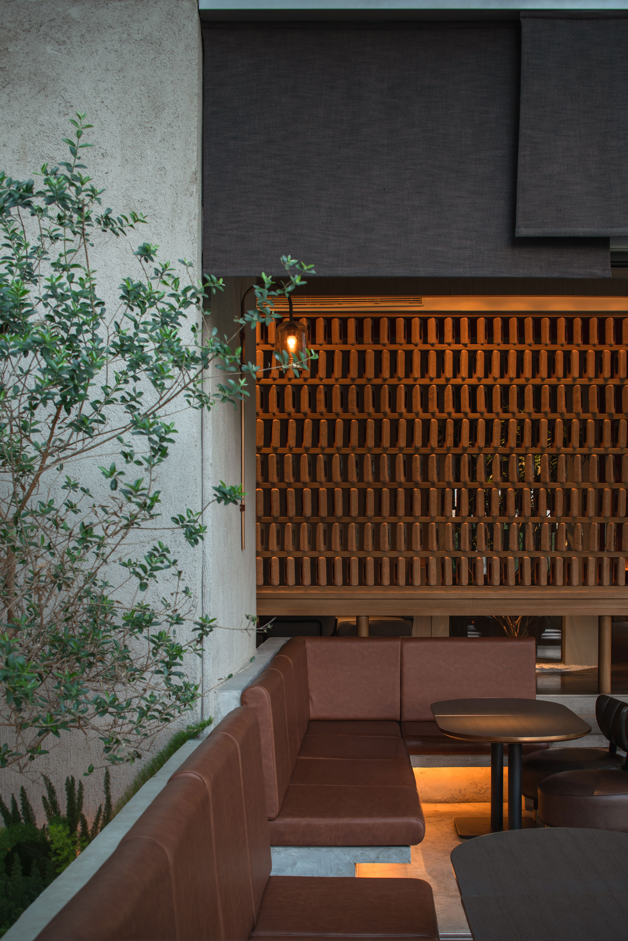
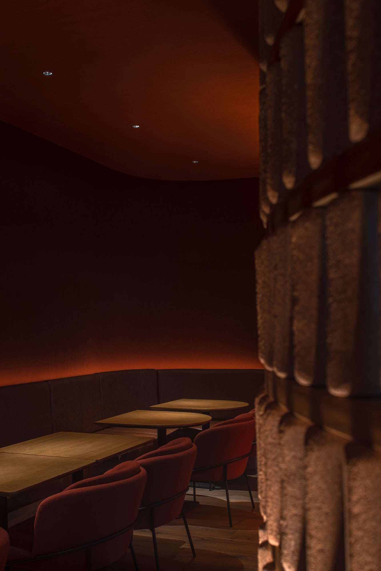
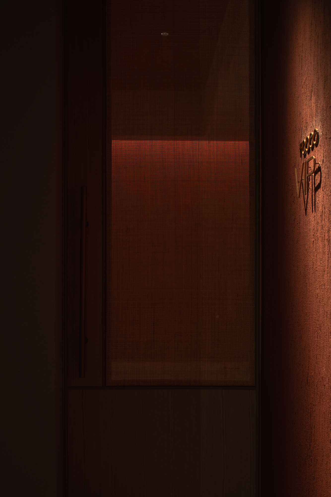
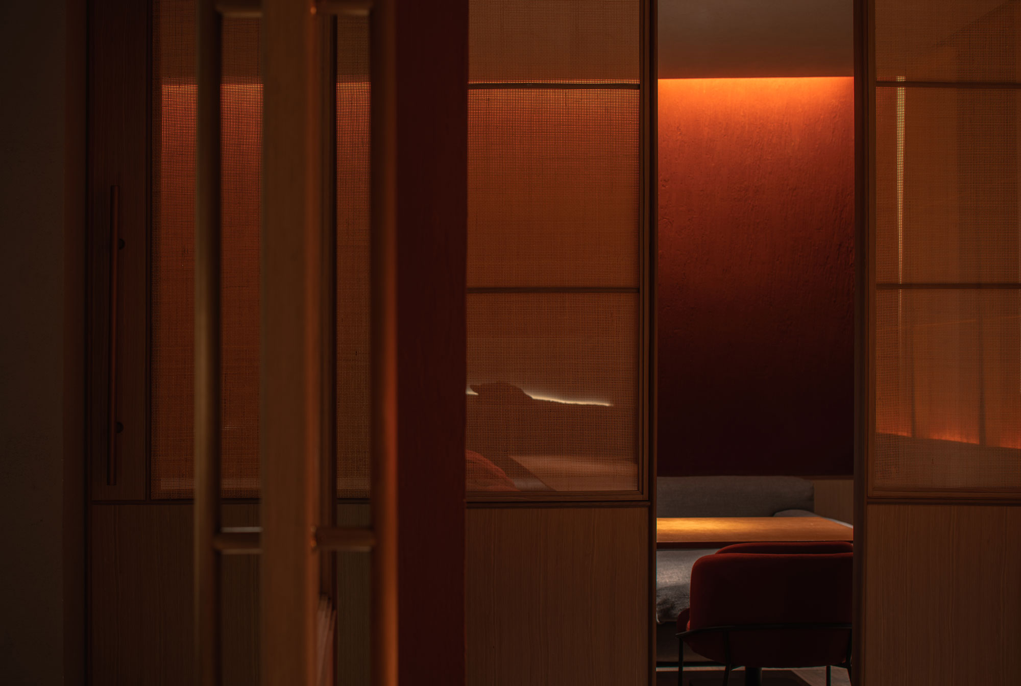
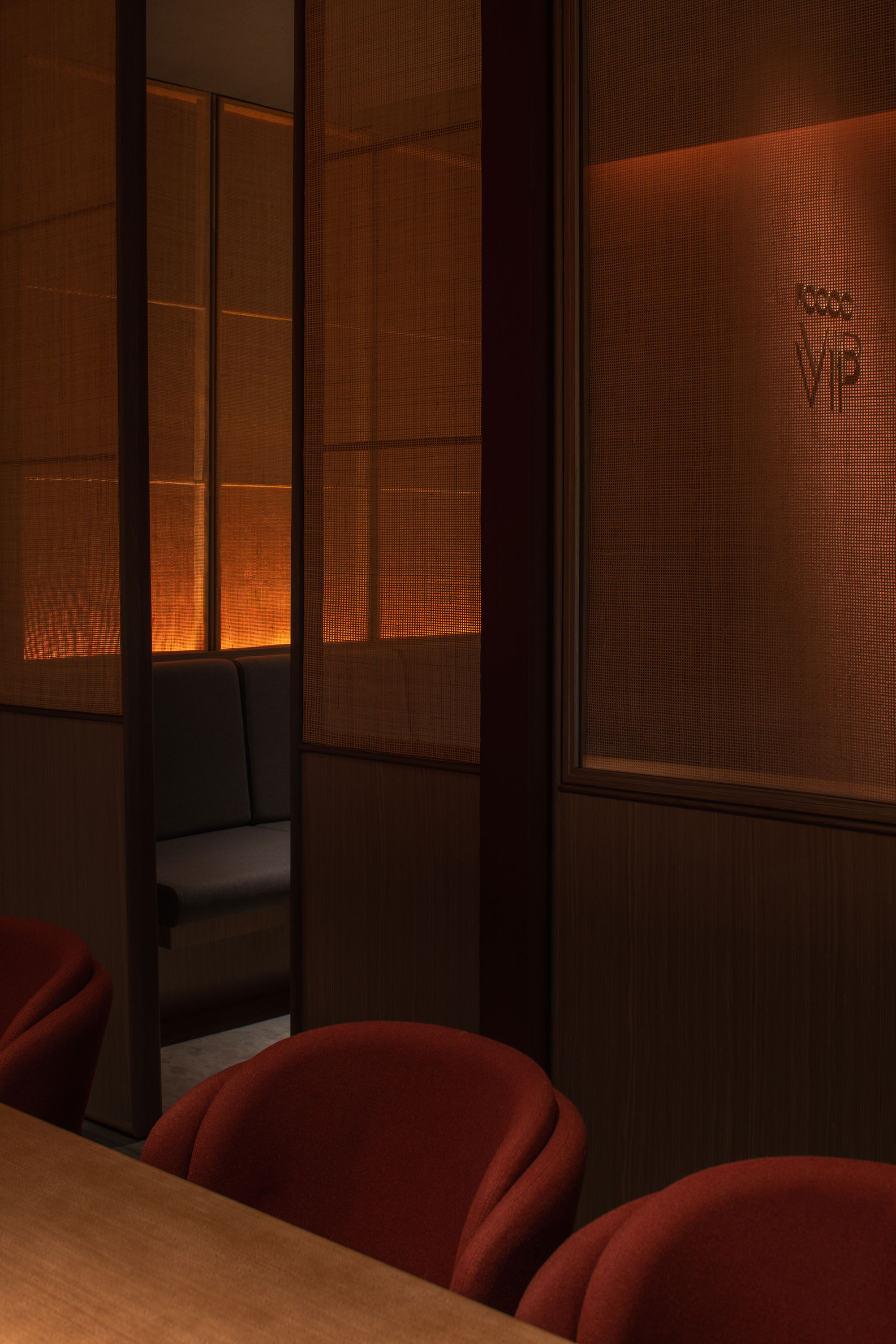
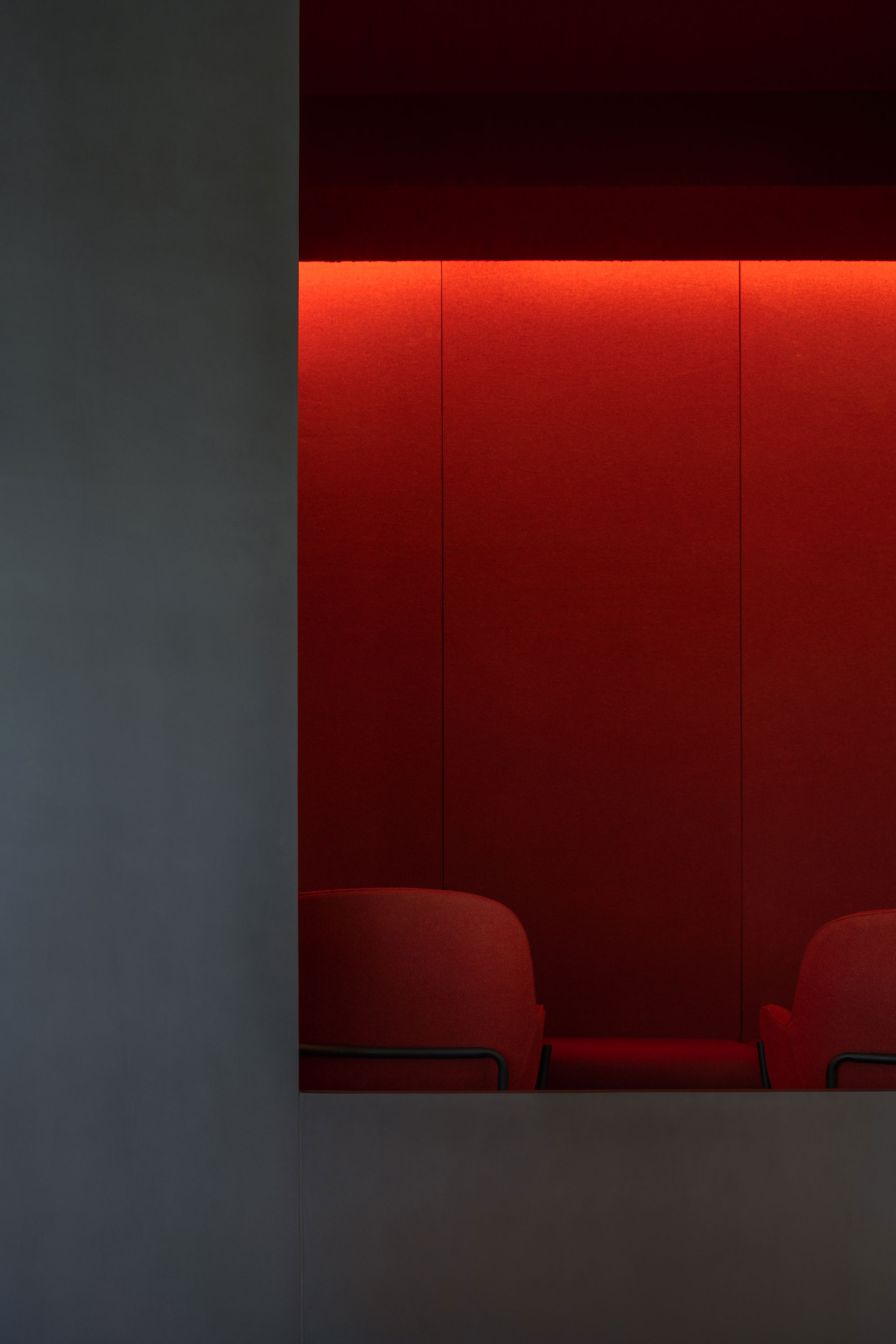
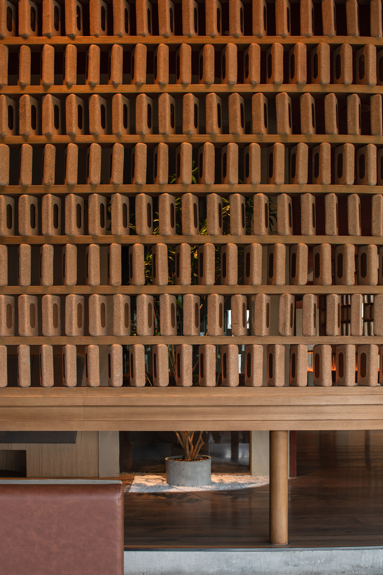
空间整体以红色及灰色为主色调,大量的砖,灰泥与木材等自然材料的运用将商业空间从都市之中置换出来,给予顾客精神上片刻的宁静。项目中包裹“庭院”的隔断曲面墙由暖色手工打磨砖块有序排列叠砌而成,划分区域的同时保证视线的贯通,砖块表面辅以金属铜片,增添视觉与触觉的均匀、柔和及平衡感,从细节着手提升整体品质。
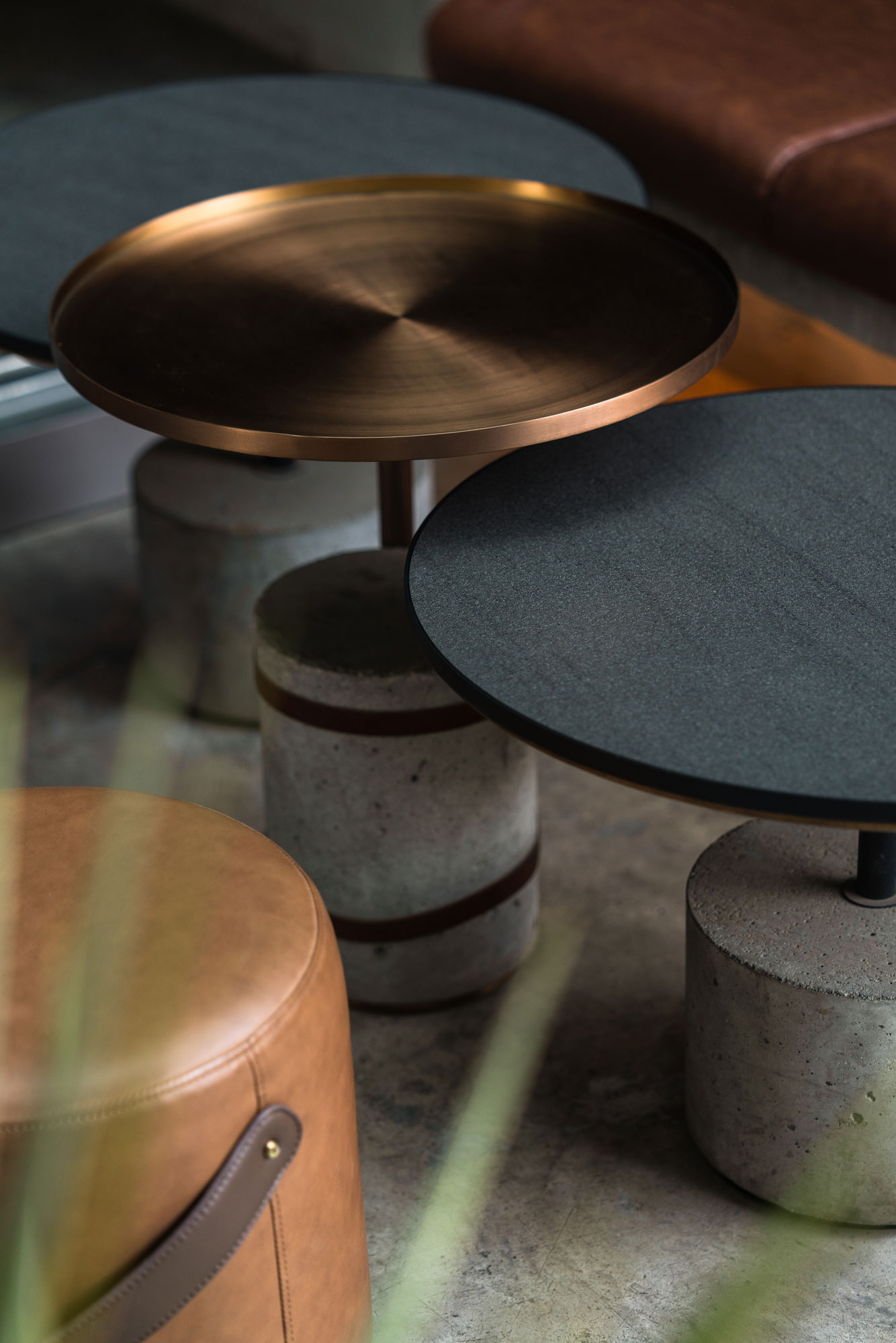
A basic palette of red and grey, evoking Chengdu's traditional architecture and ancient tea houses, has been used. Natural materials (bricks/plaster/wood) contrast with the modern and technological surroundings, giving moments of spiritual tranquillity to customers.The see-through screens, which are made of orderly arranged clay brick pavers, spacially divide the different areas while maintaining a visual connection and form the inner-yards. Each of the pavers' edges has been manually polished, and a metal copper label added, bringing refinement to an otherwise rough material.A delicate balance of rough and smooth textures, together with a simple, focused on the details scheme, make the project feel comfortable and warm yet upscale and refined.
Contact
Add
C Area,321Cultural & Creative Park,
NO.666,Donghong Road,Chengdu City.


taobao