 中文
中文
MIHA BODYTEC | 米哈研训空间
PROJECT DETAILS
Client: MIHA
Location: Chengdu,Sichuan
Chief Designer: Frank.Hoo AQ
Photography: Even Chiu 一筑一事
Area: 370㎡
Year: 2016
PERSPECTIVE | 透视图
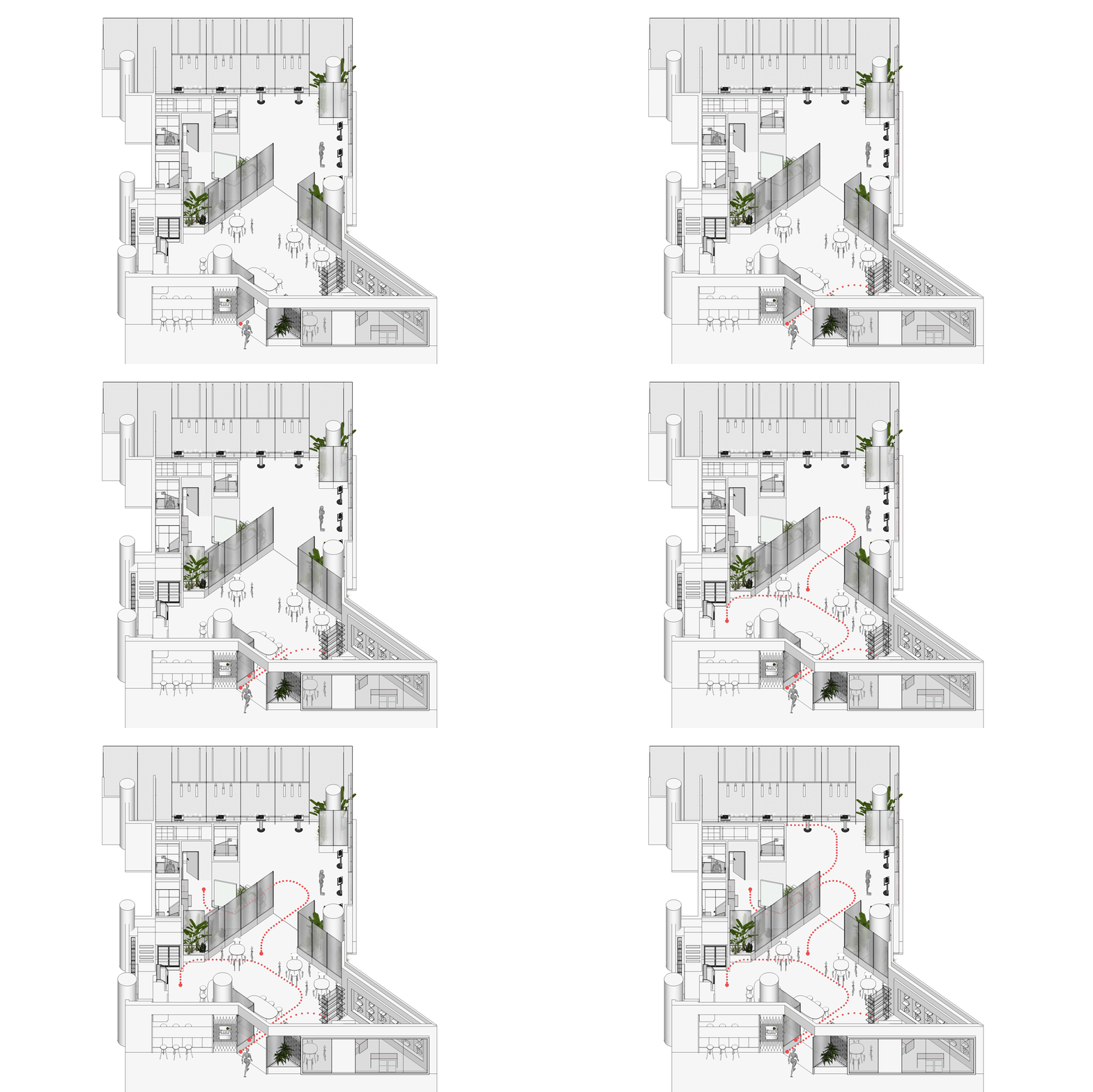
MODEL | 模型动画
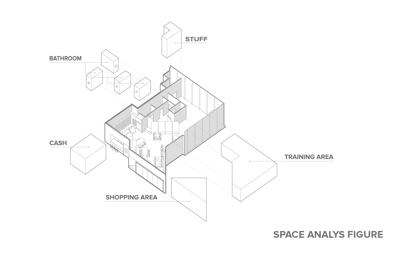
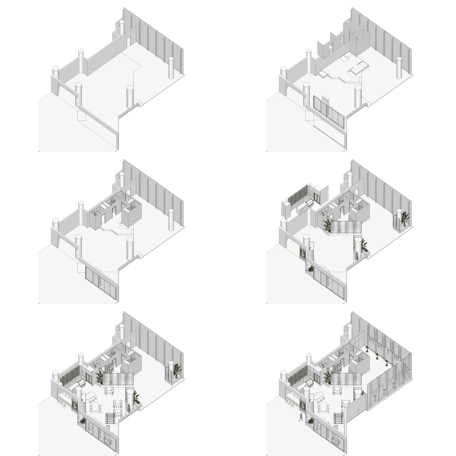
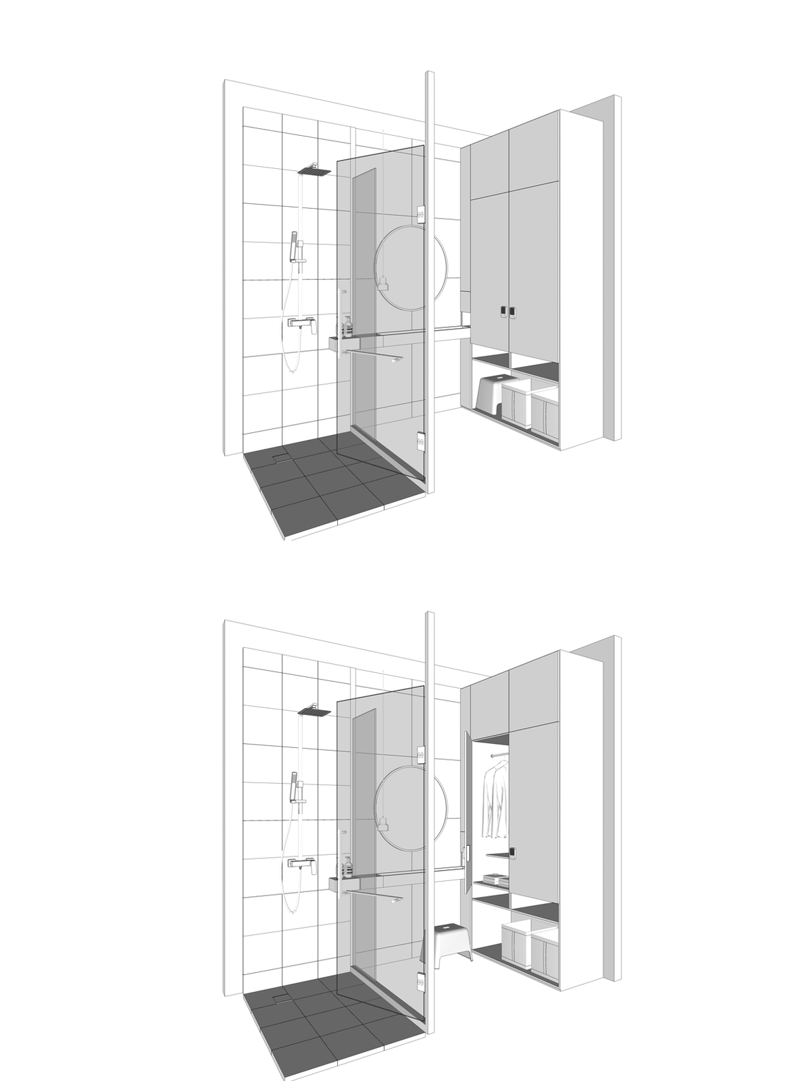
INTRODUCTION | 项目介绍
MIHA BODYTEC研训空间并不是传统意义的健身房,是一种新型运动空间。由德国尖端科技设备驱动,应对快节奏、繁重的都市生活形态,20分钟达到传统运动2~3小时的效果。高效、安全地提升运动效率、使体格精确的进步,让人体进入全身运动的新维度。
MOJO DESIGN受委托,为该品牌打造一体化视觉形象。品牌标识从维度、时间、碎片三个关键词出发,用简练的图形表达品牌主旨:高效、快速、效果显著的新型运动概念。品牌色彩以灰、白为主,与空间设计的不锈钢材质及现代感相呼应。由LOGO衍生出的图形化字体,将主概念贯穿至整体视觉。空间设计通过运用不锈钢、压纹玻璃、亚克力、植物相互搭配,对空间明确的划分,高效的利用率,来表现秩序与未来。
-
The MIHA BODYTEC Research & Training Space is not your traditional gym, instead it is a new type of exercise space which equipped with Germany's cutting-edge technology equipment. It can achieve the effect of traditional sports for 2 to 3 hours in just 20 minutes, incorporating with the fast-paced and heavy-duty urban lifestyle. With a safe increase in exercise efficiency and precise physical advancement, it allows people to enter a new dimension of whole body movement.
MOJO DESIGN was commissioned to design an integrated visual image for the brand. The image starts from three keywords: dimension, time, and fragmentation. It uses a concise graphical expression to show the brand's purpose of a new-type sports concept that is efficient, fast, and remarkable. The brand color is mainly grey and white, which echoes the stainless steel material and modern space design. The graphic font derived from LOGO demonstrates the main concept of the overall vision. Space design uses stainless steel, embossed glass, acrylics, and plants to match each other. These materials help to clearly define the space and gives a sense of order and futuristic.
Contact
Add
C Area,321Cultural & Creative Park,
NO.666,Donghong Road,Chengdu City.


taobao